Sometimes, the smallest changes make the biggest difference—especially when it comes to how people access healthcare resources online.
In this project, I worked on redesigning the landing page for I Can Be Well, a Canadian digital health platform that provides symptom checkers, local doctor directories, and wellness tools. The existing design had good intentions—but its structure made it hard for users to know what to do next.
Here’s how I approached the problem and helped shape a more user-focused design.
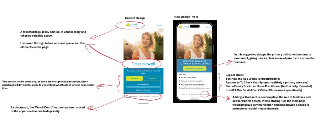
The original page layout presented users with multiple calls to action all at once, without clear guidance or hierarchy. Important elements like the app demo or symptom checker were buried among other content.
Even small things—like a repeated logo taking up space—were contributing to visual noise and confusion.
My goal was to make the landing experience more logical, accessible, and action-oriented.
My UX Priorities
- Clear hierarchy: What’s most important for users to do first? How do we guide them naturally?
- Content flow: Can we group features by relevance or sequence of use?
- Visual clarity: Are there any redundant elements that can be removed or repositioned?
- Better feedback & engagement: Can we invite communication and connect users to the team?
Design Decisions & Iterations
✅ Moved the Demo Higher
The “Watch Demo” section was buried, even though it’s the best introduction to how the app works. I moved it to the top so new users could engage with it first.
🧭 Established a Logical Flow
I reorganized the content to guide users through:
- What the app does (demo + onboarding)
- What problems it solves (symptom checker, finding doctors)
- How to get started (iOS install link)
✂️ Removed Redundant Elements
A second logo on the same page was just taking up space. By removing it, I freed up room for more useful elements.
💬 Added ‘Contact Us’
I introduced a “Contact Us” section directly on the main page, creating a clear pathway for support, feedback, and future user engagement. It’s also a space to highlight social channels.
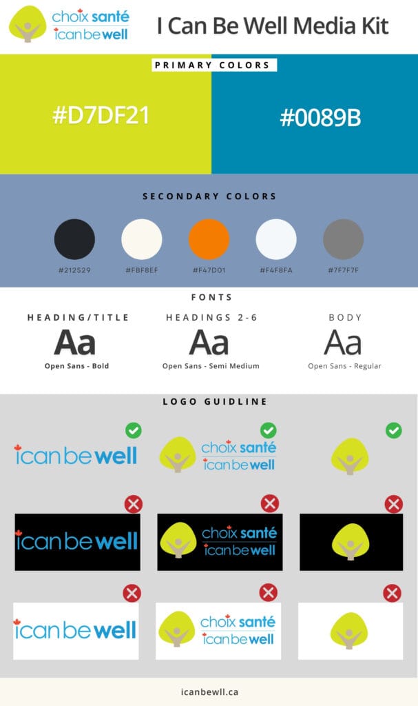
Visual Direction
Using the project’s existing media kit, I kept typography and color usage consistent with the brand while simplifying the layout and increasing whitespace for better readability.
Fonts: Open Sans (Bold, Semi Medium, Regular)
Colors: A warm palette mixing #F47D01 with clean neutrals like #F4F8FA and #FBF8EF
Outcomes & Reflections
This project reminded me that UX doesn’t always mean building something new. Sometimes, it’s about asking: What’s really essential here—and what’s just getting in the way?
By stepping back and rethinking the structure of just one page, I helped make a meaningful impact on how users engage with I Can Be Well.