I’ve been thinking about the Pulse app UX redesign and (Brightspace / D2L) experience for a while—specifically how courses are presented to students.
During a quiet evening, I decided to explore a small redesign idea. This wasn’t a full product overhaul or a critique of the existing app. Instead, it was a curiosity-driven UX exercise:
What if course organization felt lighter, clearer, and less overwhelming—especially during busy semesters?
The Problem I Was Exploring for Pulse UX Redesign
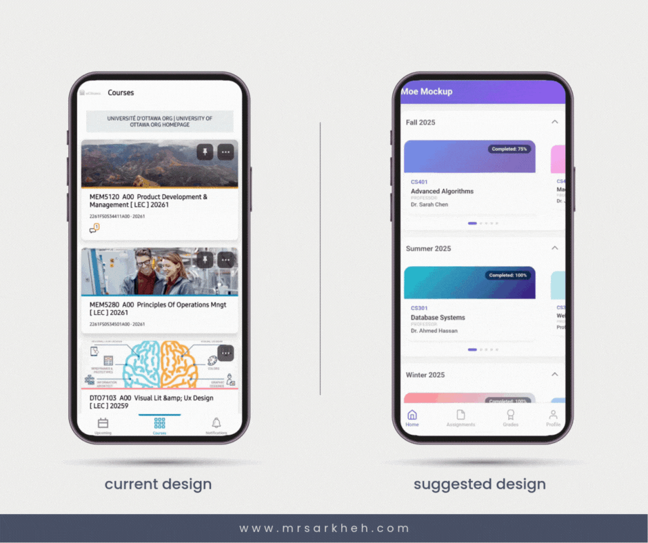
In its current form, courses are presented in a long vertical list. While functional, this approach can become overwhelming over time—especially for students juggling multiple semesters, archived courses, and active classes.
The main challenges I wanted to explore were:
- Cognitive overload from long scrolling lists
- Difficulty distinguishing active vs inactive courses
- Limited visual emphasis on progress and updates
Design Goals
Rather than redesign everything, I focused on a few targeted UX improvements:
1. Information Architecture
Courses are grouped by semester, rather than displayed in one continuous list.
This helps students mentally chunk information and quickly focus on what matters right now.
2. Visual Hierarchy
Instead of stacking all courses vertically, I introduced a horizontal carousel for each semester.
The currently active course is visually emphasized, making it easier to identify at a glance.
3. Progress Visibility
Completion percentage is more prominent on each course card, giving students immediate feedback on where they stand.
There’s also room for small indicators (like a red dot) to signal updates or notifications.
4. Reduced Scrolling Fatigue
Horizontal browsing within clear categories helps reduce endless vertical scrolling—especially helpful during midterms or finals when attention is already stretched thin.
The Result (Conceptually)
This small mockup reimagines course browsing as:
- More structured
- More glanceable
- Less mentally taxing
The goal wasn’t to replace the current design, but to explore how information architecture and visual hierarchy alone can significantly change how a product feels.
Reflections
This was a tiny side project driven purely by curiosity—and that’s exactly why I value it.
Real products like Pulse operate under many constraints: accessibility requirements, legacy systems, institutional needs, and more. A redesign is never just about “better UI.” Still, exercises like this help me think critically about how small UX decisions—layout direction, grouping, emphasis—can meaningfully affect user experience.
Open Question
If you were a student using Pulse:
Would you prefer this grouped, horizontal approach—or the traditional vertical list? Why?
I’d genuinely love to hear different perspectives.