When I designed the interface for Mimra Digital, I knew I wanted it to feel professional but approachable. Clean but not cold. It had to reflect the kind of work I do—thoughtful, intentional, and quietly confident.
Every UI decision was made with that feeling in mind.
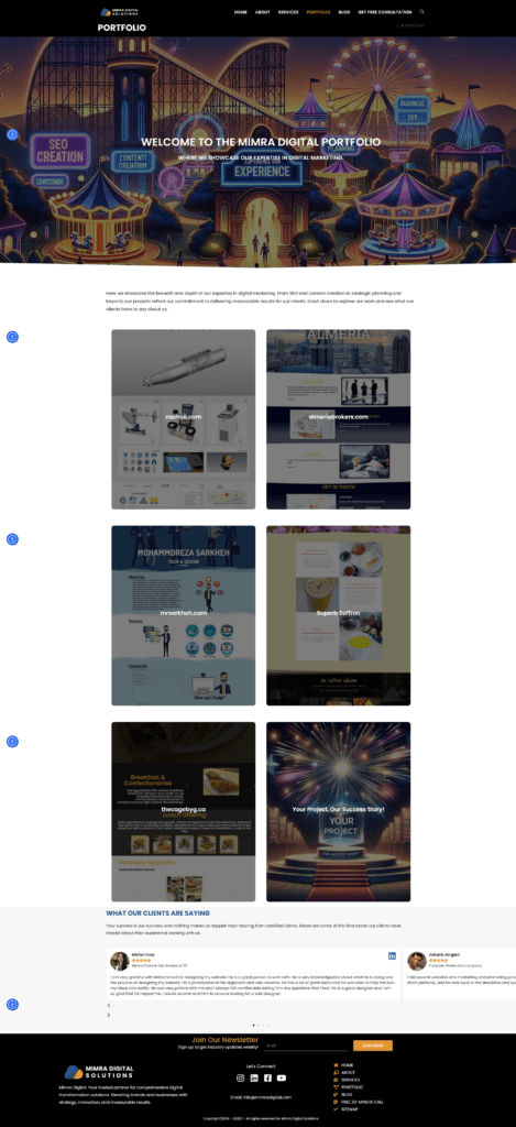
Choosing the Right Look & Feel
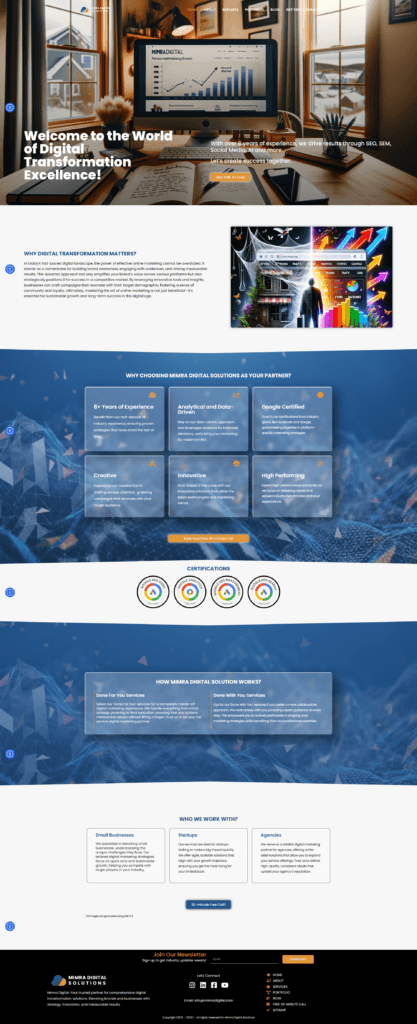
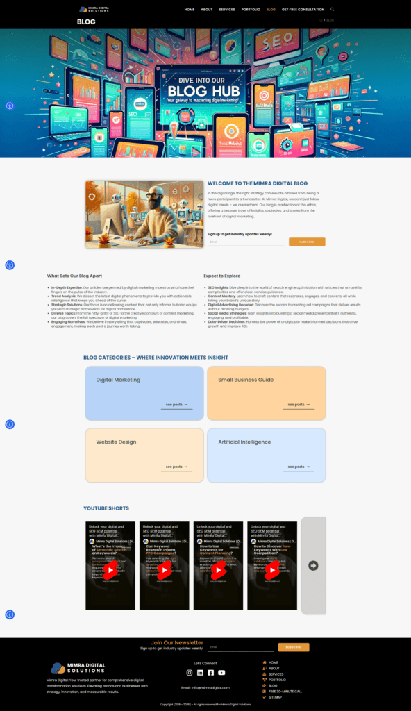
I started by creating a minimal color palette. Instead of flashy hues, I went with neutral tones paired with soft accents. This created a sense of calm and clarity—exactly what I want clients to feel when they land on the site.
Typography was just as deliberate. I used a clean sans-serif font system that’s highly legible across screen sizes. Headlines are bold but not aggressive. Body text is comfortable and easy on the eyes.
Layout & Spacing
One of my biggest UI principles is breathing room. So I used generous padding and white space throughout the site. It gives each section clarity and focus, and it helps guide the user’s attention naturally down the page.
I also followed a strict grid system to ensure consistency across sections—even as I introduced visual variation (like callout blocks or image/text pairings) to keep things interesting.
Reusable Components
To make the site scalable and maintainable, I designed a set of reusable components:
- Buttons with consistent states (hover, active, disabled)
- Card layouts for future case studies or services
- Clear, styled form elements that align with the rest of the UI
This approach supports both usability and brand cohesion as the site evolves.
Mobile Responsiveness
Mobile wasn’t an afterthought—it was a core part of the design. I made sure:
- Touch targets were big enough
- Text didn’t wrap awkwardly
- Navigation stayed intuitive, even on smaller screens
Every break point was tested and refined to keep the experience smooth and consistent.
UI That Reflects My Values
This project wasn’t just about building a portfolio site. It was about expressing the values of my design practice:
- Clarity
- Balance
- Empathy
Through minimal UI, purposeful spacing, and intuitive interaction, Mimra Digital feels like me. That’s the best part of designing your own interface—it’s not just what you make, but how it reflects who you are as a designer.