One of the biggest eye-openers for me in UX wasn’t a case study or lecture—it was a moment at work.
I was managing digital marketing for a higher education site, and while we were seeing strong traffic, the number of leads generated through the website was disappointingly low. People were visiting, browsing, and then… disappearing.
So I dove into the data.
Using analytics, I tracked user behavior through our lead generation forms and spotted a clear trend: users were dropping off halfway through the process. The form was too long, too complex, and lacked clarity.
What I Did
I applied a human-centered design mindset to rework the form experience:
- Reduced required fields to only what was absolutely necessary
- Grouped questions logically to reduce cognitive load
- Added tooltips and instructions to clarify confusing parts
The Result
The impact was immediate:
- Form submissions went up significantly
- Lead quality stayed strong
- Stakeholders were impressed—especially because it required no new tools or tech, just smart design decisions
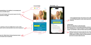
UI Considerations
While simplifying the form from a UX perspective was key, I also took time to rethink the interface design to support a smoother, more reassuring user journey.
Here’s what I focused on:
- Visual hierarchy: I used color and spacing to guide the eye through the form naturally—grouping related questions and giving each section breathing room.
- Typography: I ensured all labels and instructions were easy to read and visually distinct from user input fields.
- Microinteractions: Subtle animations and state changes (e.g., green check marks for valid inputs) gave users immediate feedback and a sense of progress.
- Mobile responsiveness: I redesigned the layout to work smoothly across screen sizes, ensuring touch targets were large and well-spaced on mobile.
The result? A cleaner, calmer interface that didn’t just function better—it felt better to use.
Why It Mattered
This experience taught me that UX doesn’t have to be flashy to be effective. Sometimes, solving a small friction point can unlock huge value—both for the user and the business.
It also showed me how critical it is to frame UX in terms leadership understands: user behavior, conversion metrics, and ROI. That’s how I secured buy-in for future UX improvements in the org.