When you’re on the hunt for a job, every click matters. The experience should feel empowering, not frustrating. That’s what led me and my team to take a closer look at the Government of Canada Job Bank website—a platform that plays a huge role in helping Canadians find work, yet struggles with user experience in ways that impact real outcomes.
We wanted to dig into how people actually use this platform, what challenges they face, and how we could make it better—not just visually, but functionally and emotionally too.
Why We Chose the Job Bank
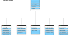
The platform is widely used and deeply important—yet it often feels like it’s stuck in the early 2000s. Between confusing layouts, outdated design choices, and missing features that users have come to expect from modern job boards, we saw a clear opportunity for improvement. More importantly, we wanted to understand how these design issues were affecting real job seekers trying to make important life moves.
Getting to the Root: Research First
We started with a two-pronged approach: heuristic evaluation and user surveys.
For the heuristic part, we leaned on Jakob Nielsen’s 10 usability heuristics—looking for issues around clarity, consistency, feedback, and more. Right away, we noticed problems: the search function was clunky, filters were limited, and the visual hierarchy made it hard to know where to start.
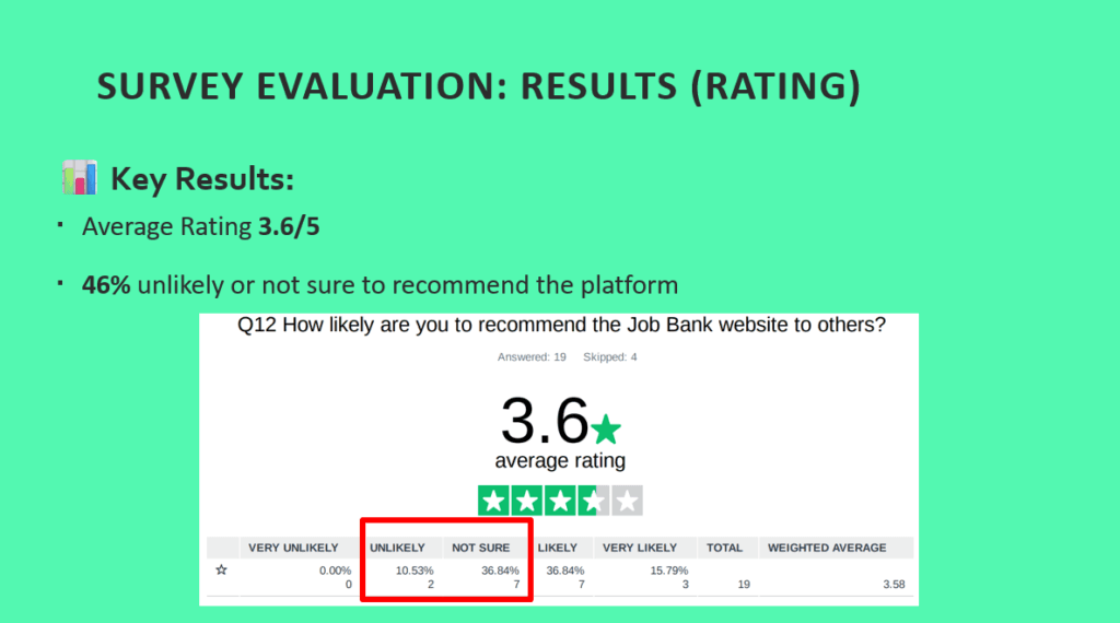
But we didn’t want to just rely on expert opinion—we wanted to hear from actual users. So we created a survey and got responses from 19 Canadian job seekers between 18 and 54. What we heard confirmed our hunches:
- Nearly 80% found parts of the site confusing or hard to follow
- Many said the filtering system was frustrating or lacked important options
- The average rating of the site? Just 3.6 out of 5
For a platform meant to support people during a critical time in their lives, that simply isn’t good enough.
Turning Insights Into Action
With the problems clear, we shifted into design mode.
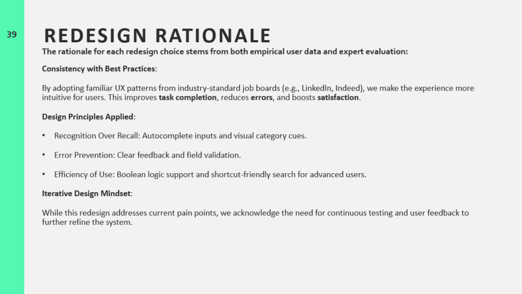
Our guiding hypothesis was this: if we improve the search filters, simplify the layout, and align the interface with user expectations, we can drastically improve both satisfaction and success rates on the platform.
Here’s what we proposed:
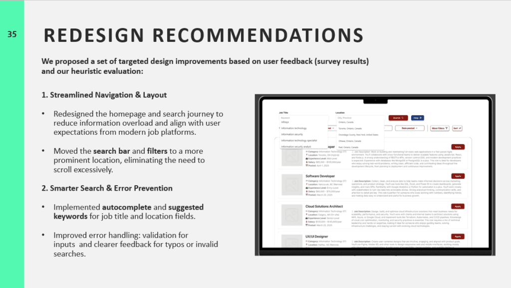
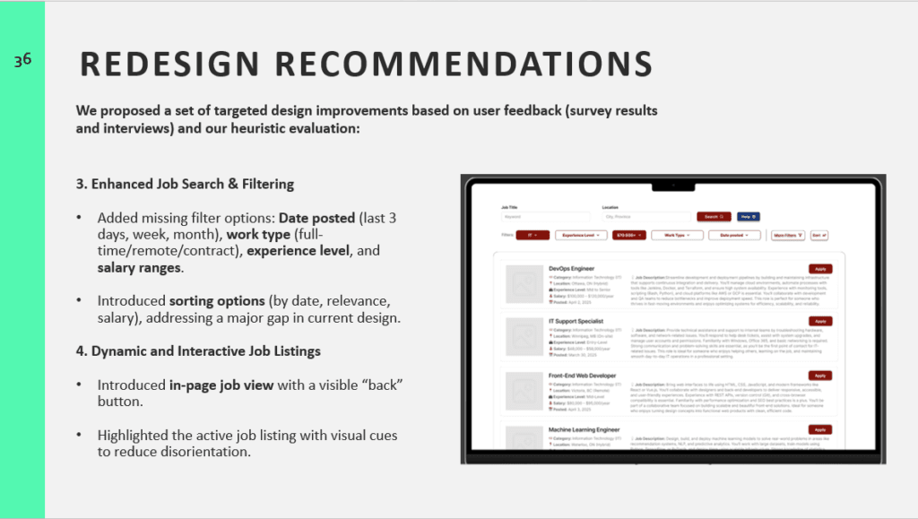
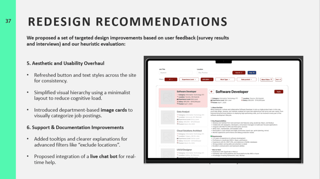
- Make the search bar the hero of the homepage—easier to find, easier to use.
- Add smart filters like “remote jobs,” “experience level,” or “posted within the last week”—the kinds of things people expect from platforms like LinkedIn or Indeed.
- Streamline navigation by introducing in-page job previews and a consistent “back” button.
- Improve feedback with autocomplete, better error messages, and tooltips for advanced filters.
- And finally, refresh the visual design to reduce cognitive load and improve clarity—less text, more focus.
Reflections & What’s Next
Working on this project reminded me just how tightly UX is tied to real-world outcomes. It’s not just about making something “look nice”—it’s about helping people achieve goals with less friction and more confidence.
If we had more time (and resources), I would have loved to take this a step further: testing our redesigns with users, gathering feedback, and iterating even more. I’d also want to bring in the employer side of the platform, which we didn’t cover this time.
Still, I’m proud of what we did—and I know this experience sharpened my skills in balancing business goals, user needs, and design best practices.
Thanks for reading! If you’re curious to see the full presentation or want to chat UX research and design, get in touch or connect with me on LinkedIn.