When I started Mimra Digital, I wasn’t just building a business—I was designing an experience.
As a UX designer, I knew the website needed to do more than just look good. It had to communicate value clearly, reflect my brand, and guide visitors toward working with me—all without feeling pushy or overwhelming.
This wasn’t just a portfolio project. It was personal.

The Challenge
The goal was to create a clean, confident digital presence for my design studio that:
- Felt approachable, but still professional
- Clearly communicated the services I offer
- Built trust quickly for potential clients
- Encouraged outreach without a hard sell
I wanted something minimal, intentional, and rooted in good UX principles—not just flashy design.
My UX Approach
1. Clarity First
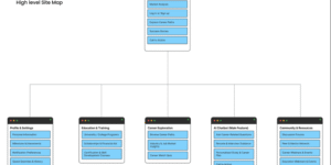
One of my top priorities was removing unnecessary friction. Every word, every section had to serve a purpose. The homepage introduces Mimra Digital with a clear value statement, followed by short, focused sections that explain what we do, who we do it for, and how to get in touch.
2. Trust Signals
From consistent typography to well-spaced layout choices, every visual decision aimed to make visitors feel at ease. Small touches like a clean contact form and thoughtful microcopy go a long way.
3. Content Prioritization
Rather than overload the site with text, I used a minimal content strategy. People don’t need paragraphs of pitch—they need to understand: What do you offer? Is this for me? Can I trust you? My content answers these questions quickly.
4. Visual Identity
The branding (colors, typography, layout) reflects my personal design aesthetic—balanced, soft, modern. I wanted Mimra to feel like a creative partner, not a corporate agency.
Tools & Stack
- Built with: WordPress (for flexibility and design freedom)
- Design system: Custom color palette and component-based layout
- Fonts: Clean, readable Poppin across all devices
What I Learned
Designing for yourself is one of the hardest things to do—but also one of the most rewarding.
This project taught me how to balance aesthetic choices with conversion goals. It helped me clarify my offering, fine-tune my messaging, and solidify what “good design” means to me—not just visually, but in how it makes people feel.
What’s Next?
Mimra Digital is still evolving. I’m always testing small changes, updating messaging, and thinking about how to make the experience even smoother for visitors. In the future, I’d love to integrate client stories or case studies directly on the site.
For now, Mimra is live—and it’s doing what I hoped it would: opening doors, starting conversations, and feeling authentically me.